Ra
Creative rollout for Ra’s 2025 album, Pretty in Motion.
ClientRaServicesTypography, Packaging, Merchandise DesignYear2025
Typography
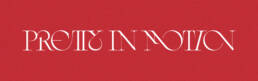
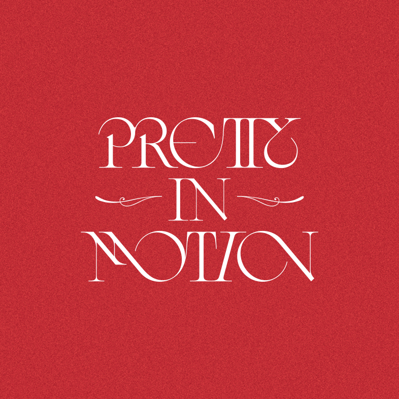
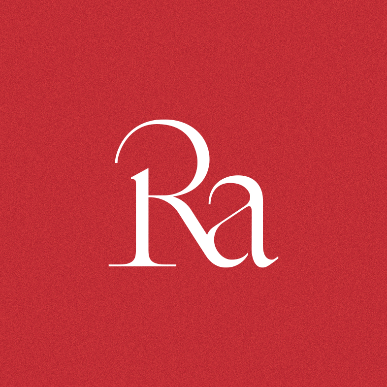
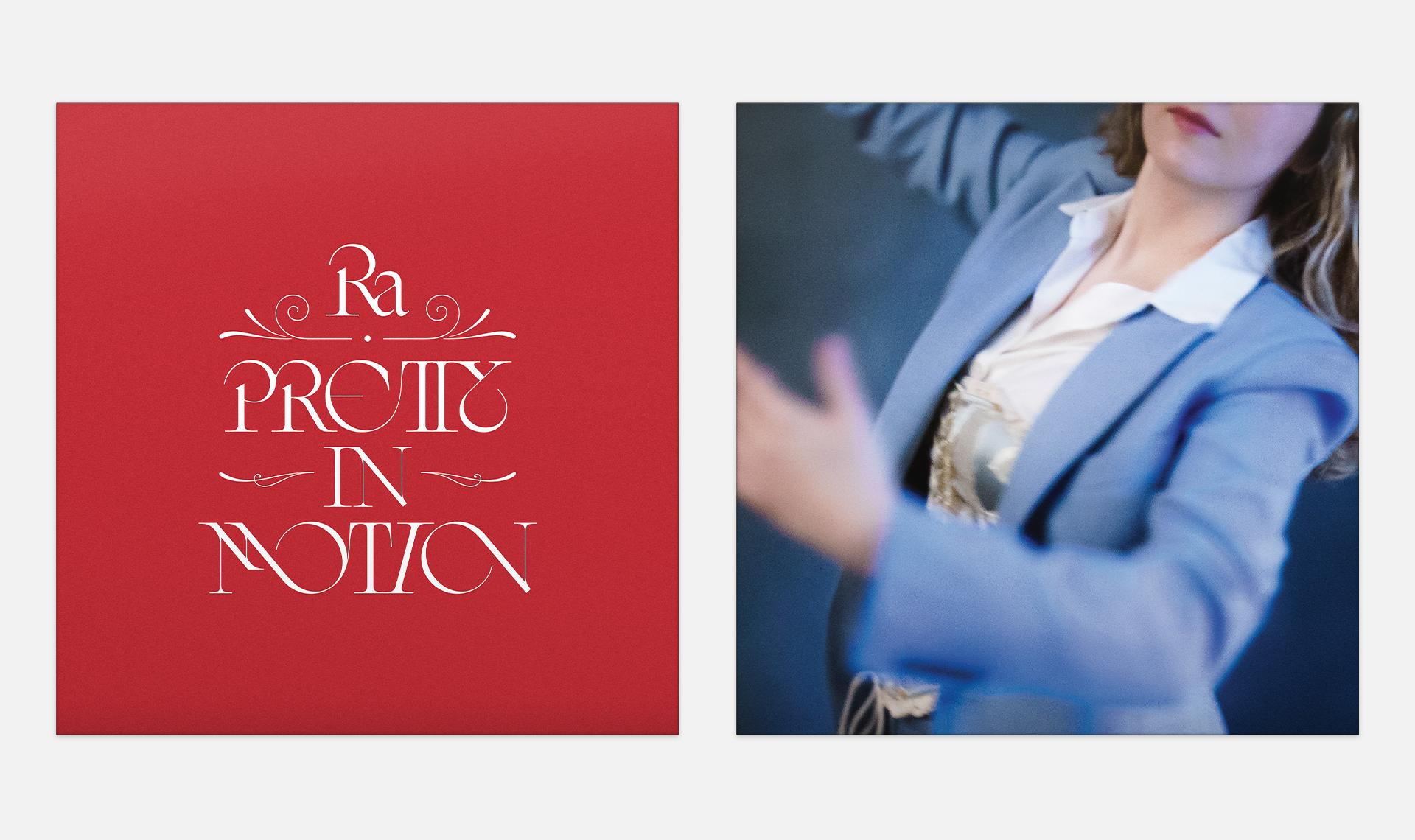
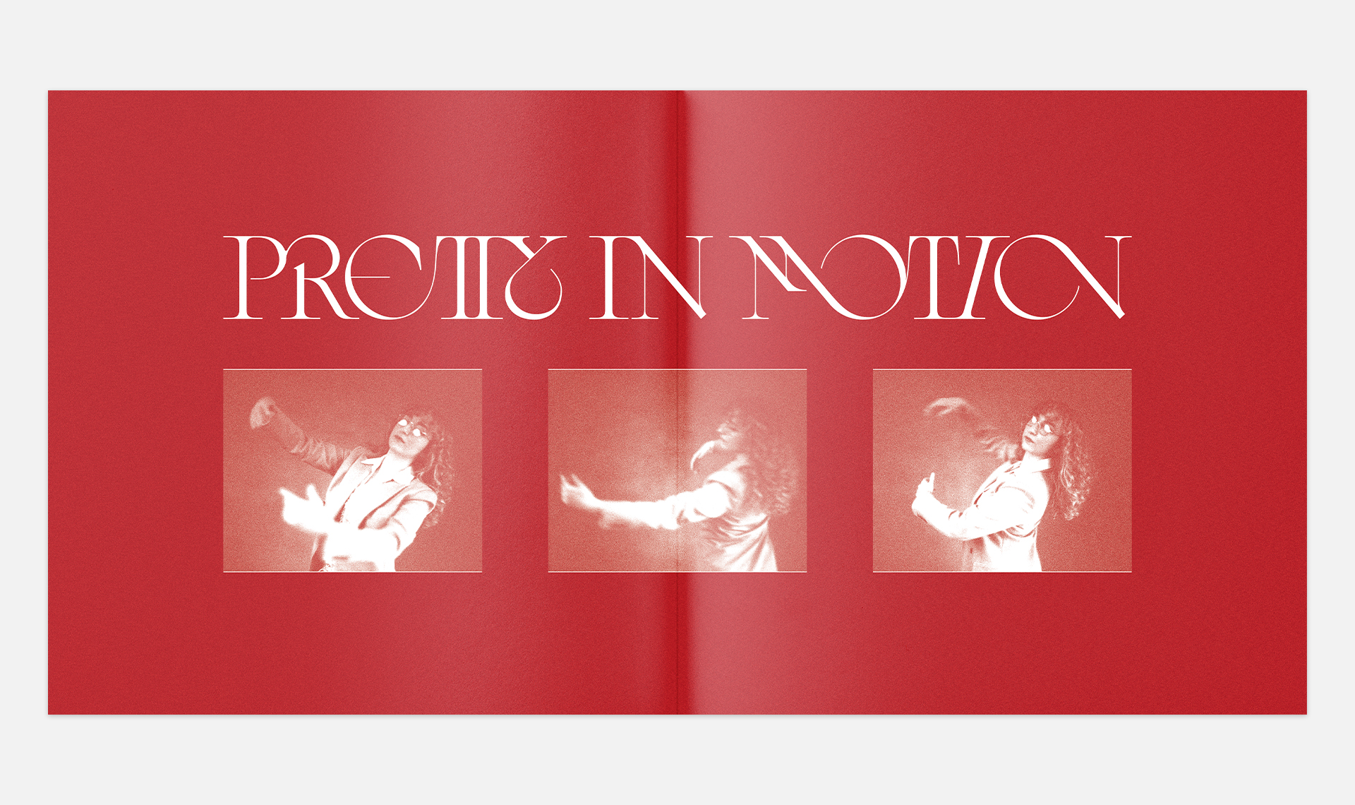
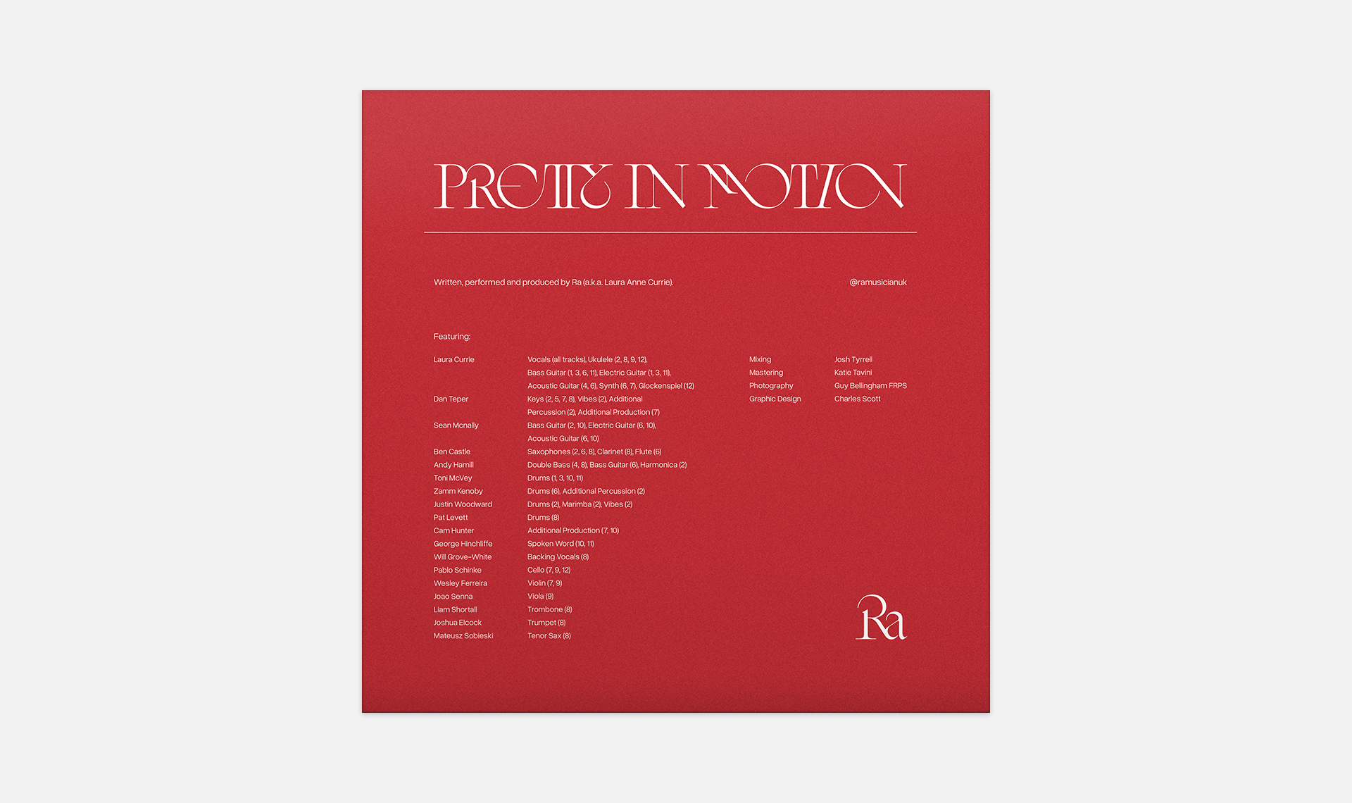
The starting point for this project was the wordmark for the album title, Pretty In Motion. Laura (“Ra”) was looking for something that felt classic and sophisticated, while conveying a sense of depth and motion. The final mark was largely rooted in classic serif forms, but accentuated with sweeping curves and ligatures to bring that motion out. I developed a “Ra” mark as well to have something that could stand next to the title without feeling out of place.
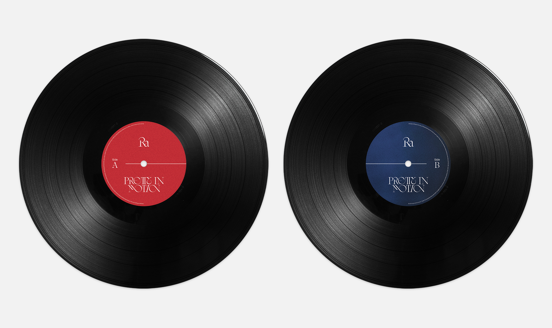
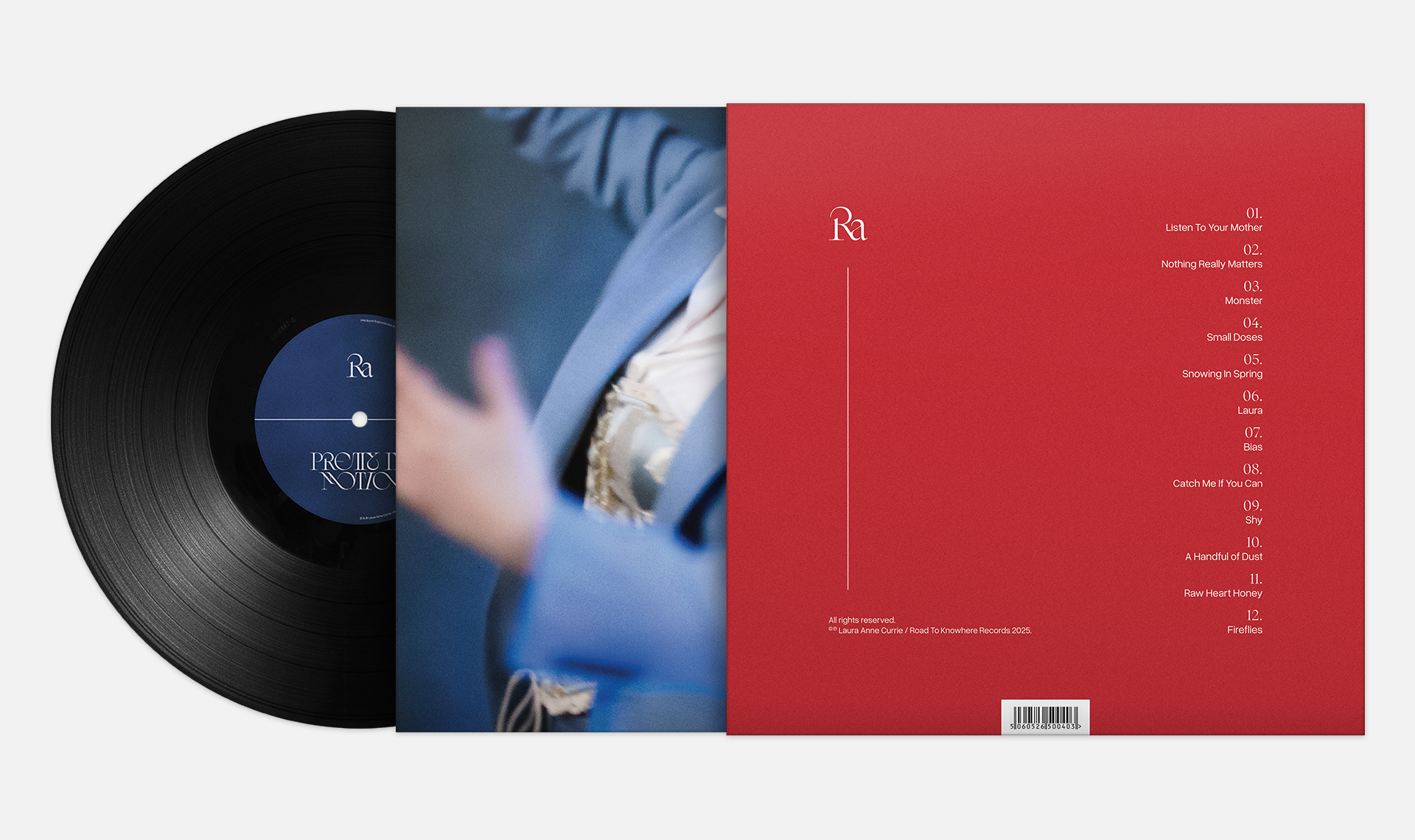
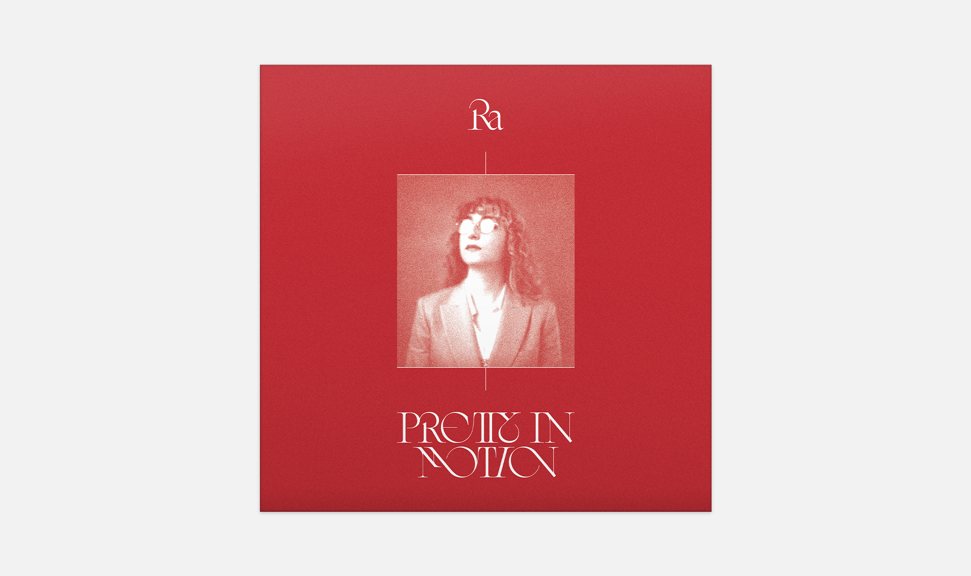
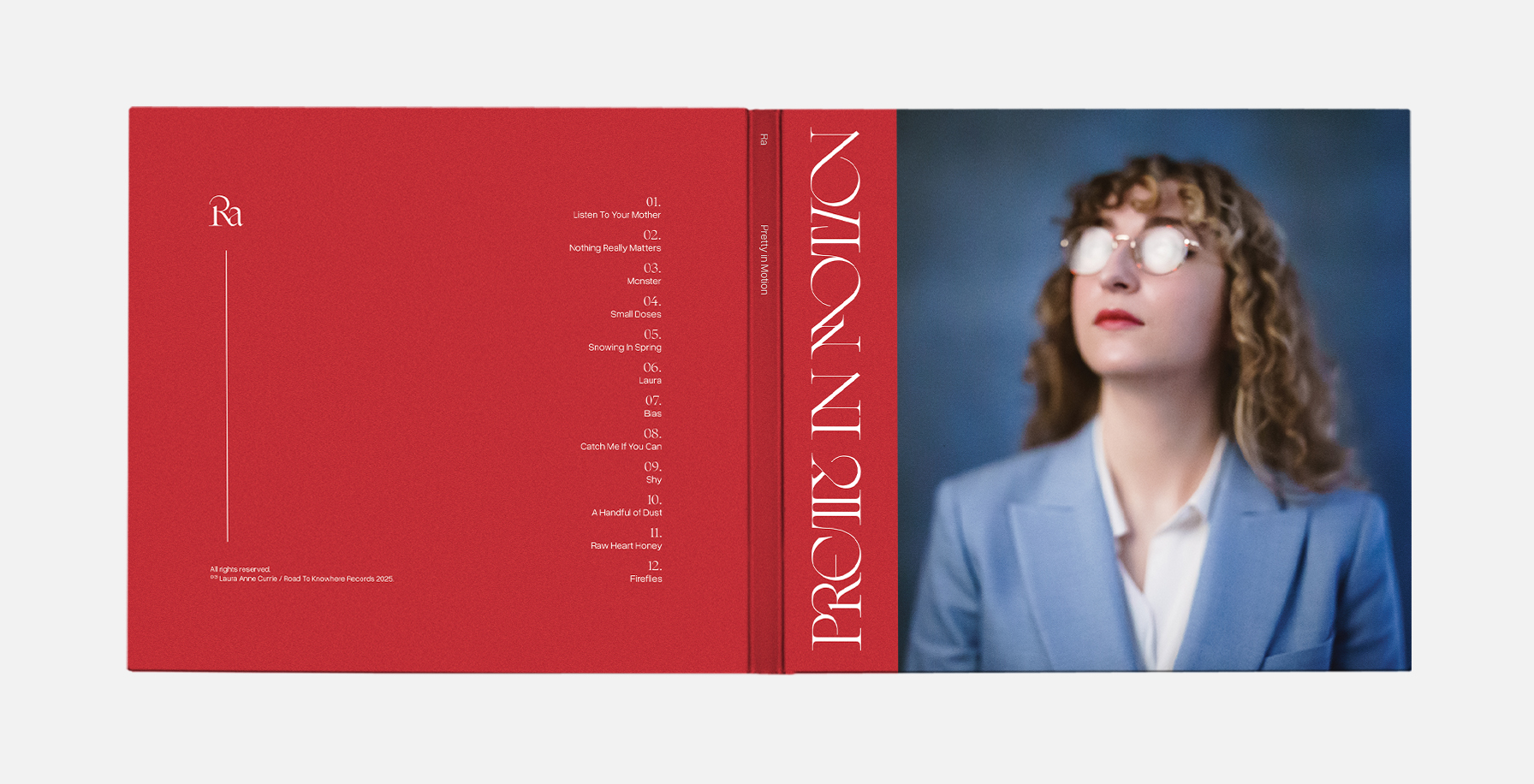
Vinyl Packaging
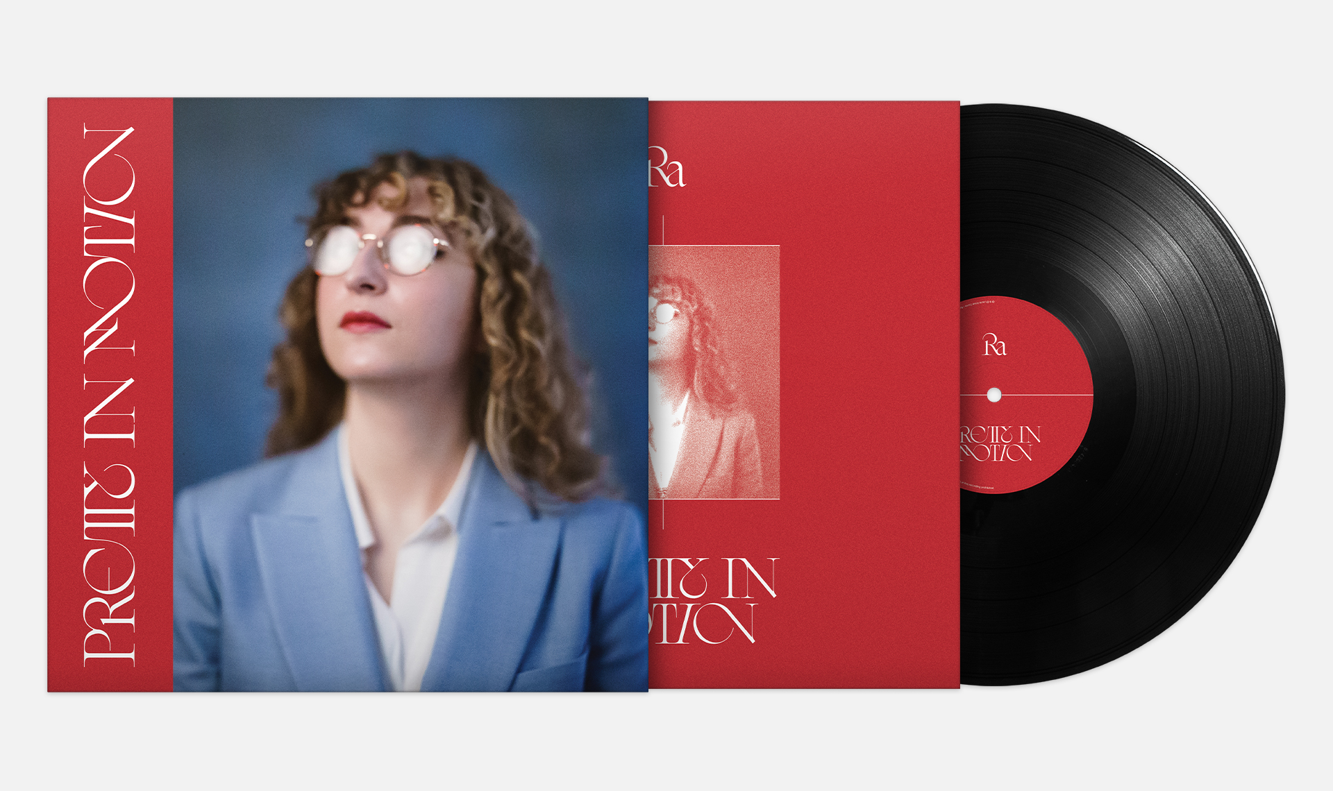
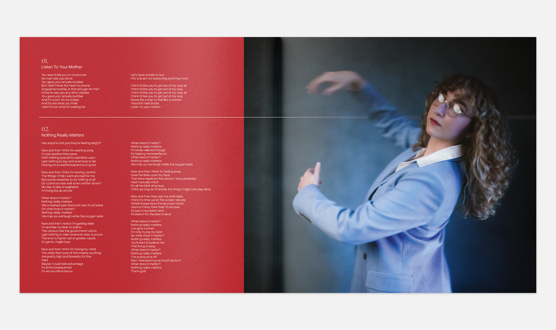
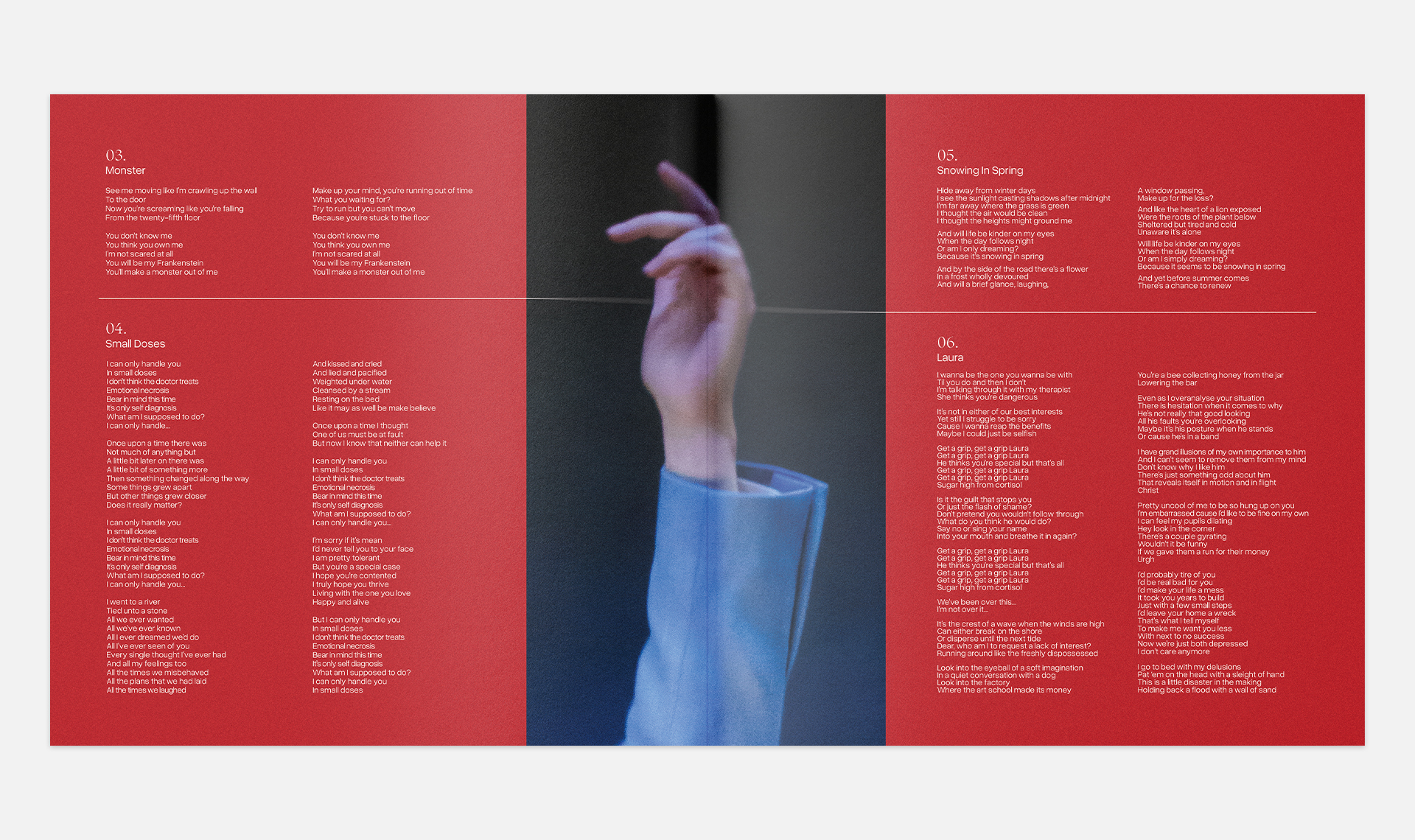
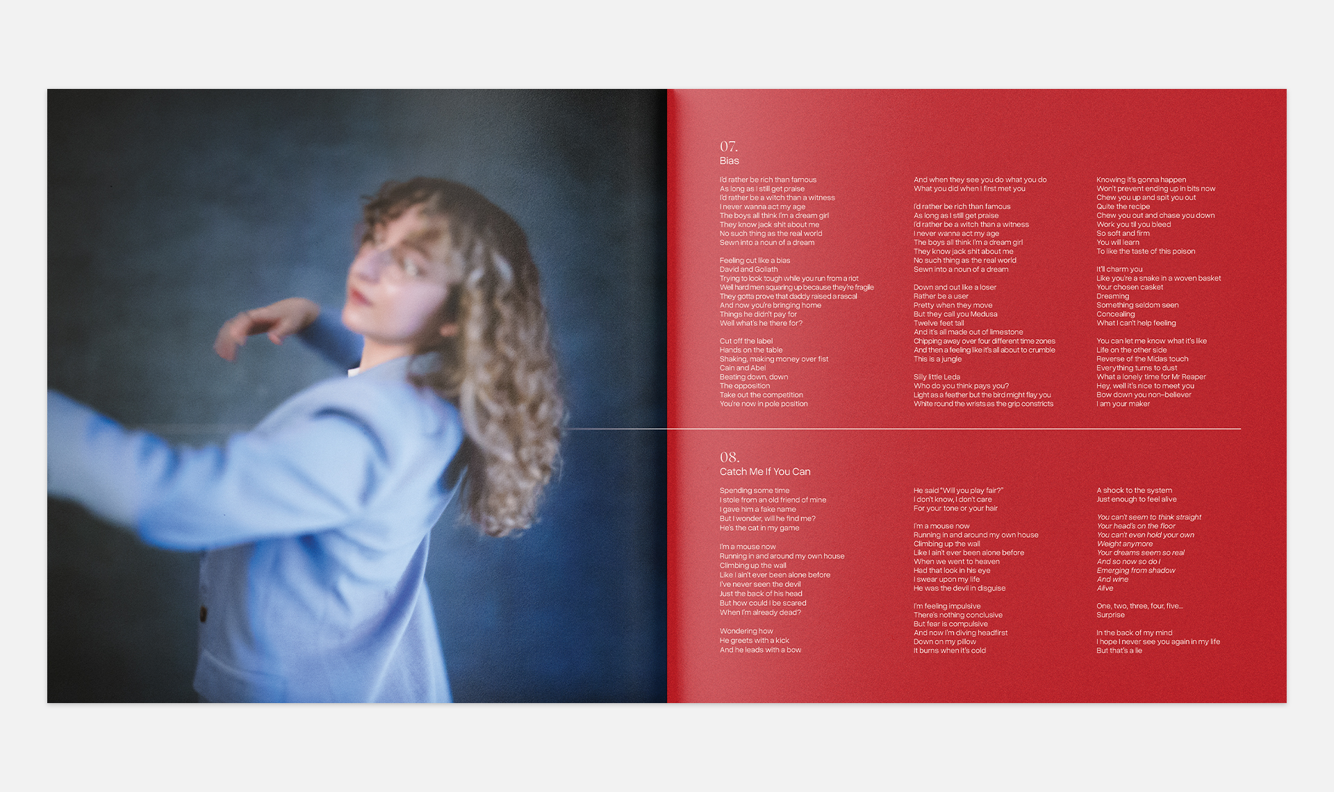
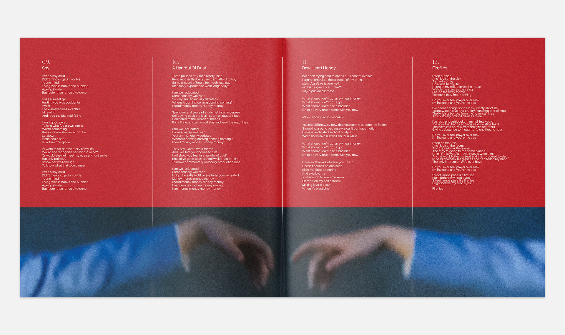
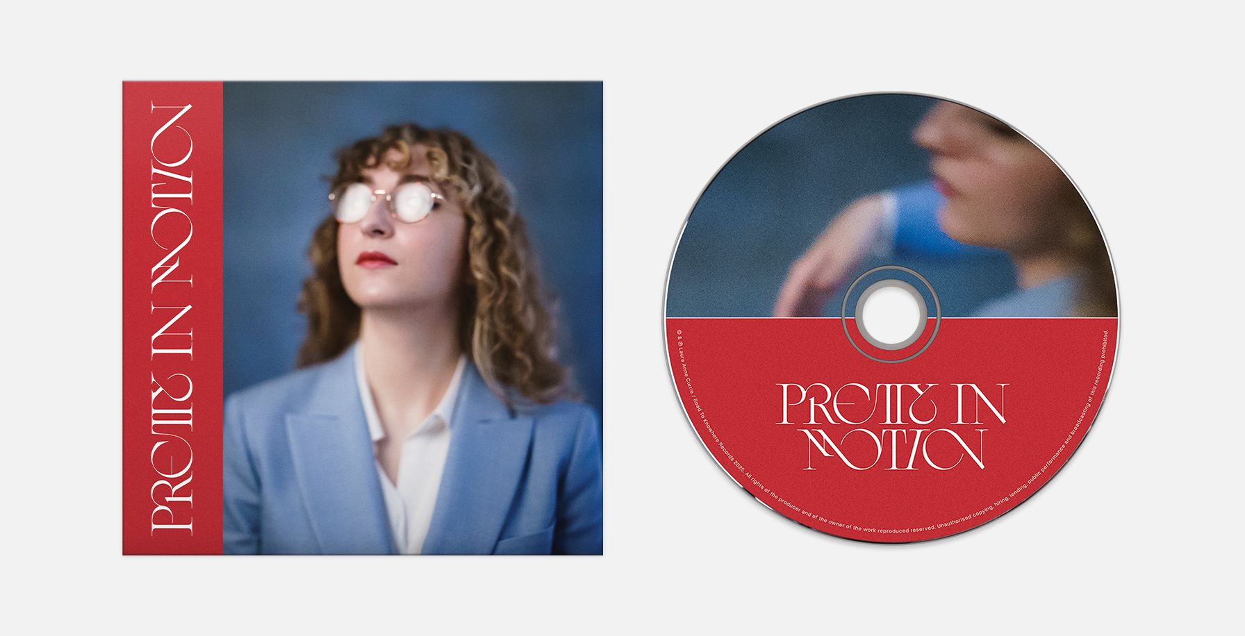
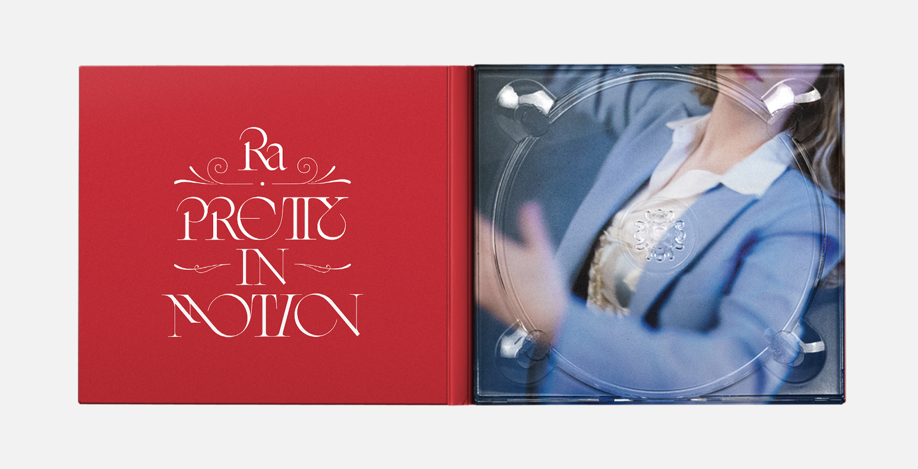
Laura came to me with a series of photos of herself to serve as a basis for creating the packaging. I built out the layout using these images as a focal point, designing with their integration in mind and creating small interactions between the layout elements and the photos. We settled on using a deep red in the layout to contrast with the blue tone of the photography, and also to bring out the red in Laura’s lips. From there it was a matter of keeping things clean and refined, and highlighting the photography as much as possible.
CD Packaging
The layout for the vinyl packaging was translated and adjusted for CD release.
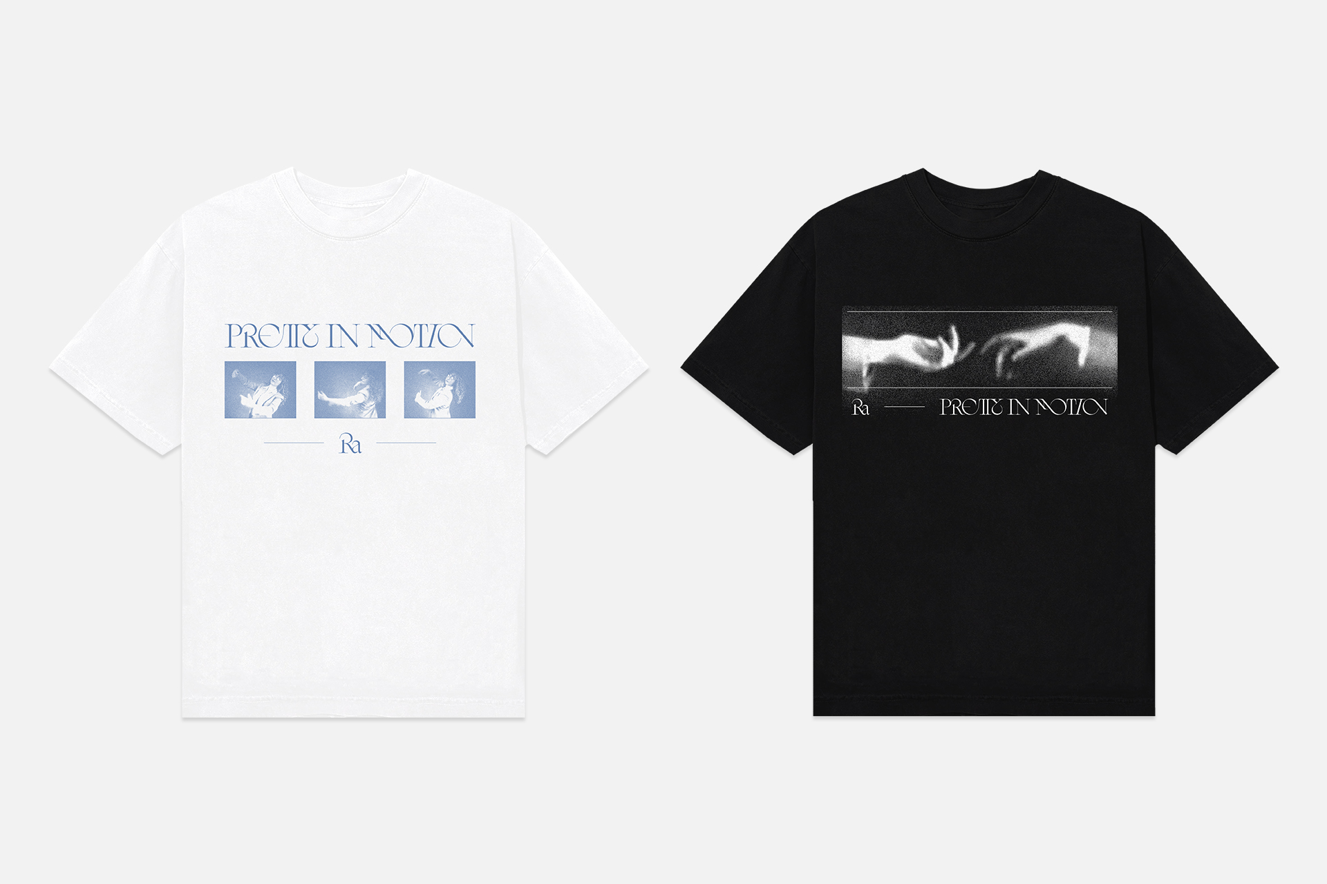
Merchandise
The merch designs drew upon and recontextualized elements or ideas that appeared in the packaging. The white tee lifts the sequence of photos from the middle spread of the booklet with an added logo placement. The black tee composites two photos of Laura’s hands to mimic The Creation of Adam.